Teenage Engineering
sound & music simplified
Teenage engineering
A unique brand from Sweden, with a bizarre name Teenage Engineering offers a unique range of tech products that are both inspiring and fully functional. If you love creating music and love minimalistic/industrial product design that is also reminiscent of Ikea, Lego and Japanese tech… then go and check it out here.
However, I personally found the navigational experience frustrating for a new user. They have great products that are user-friendly, but suprisingly the website doesn’t reflect this in the same way. As a result, I decided to decipher my pain-points and create a revamped concept with a streamlined navigation and structure.

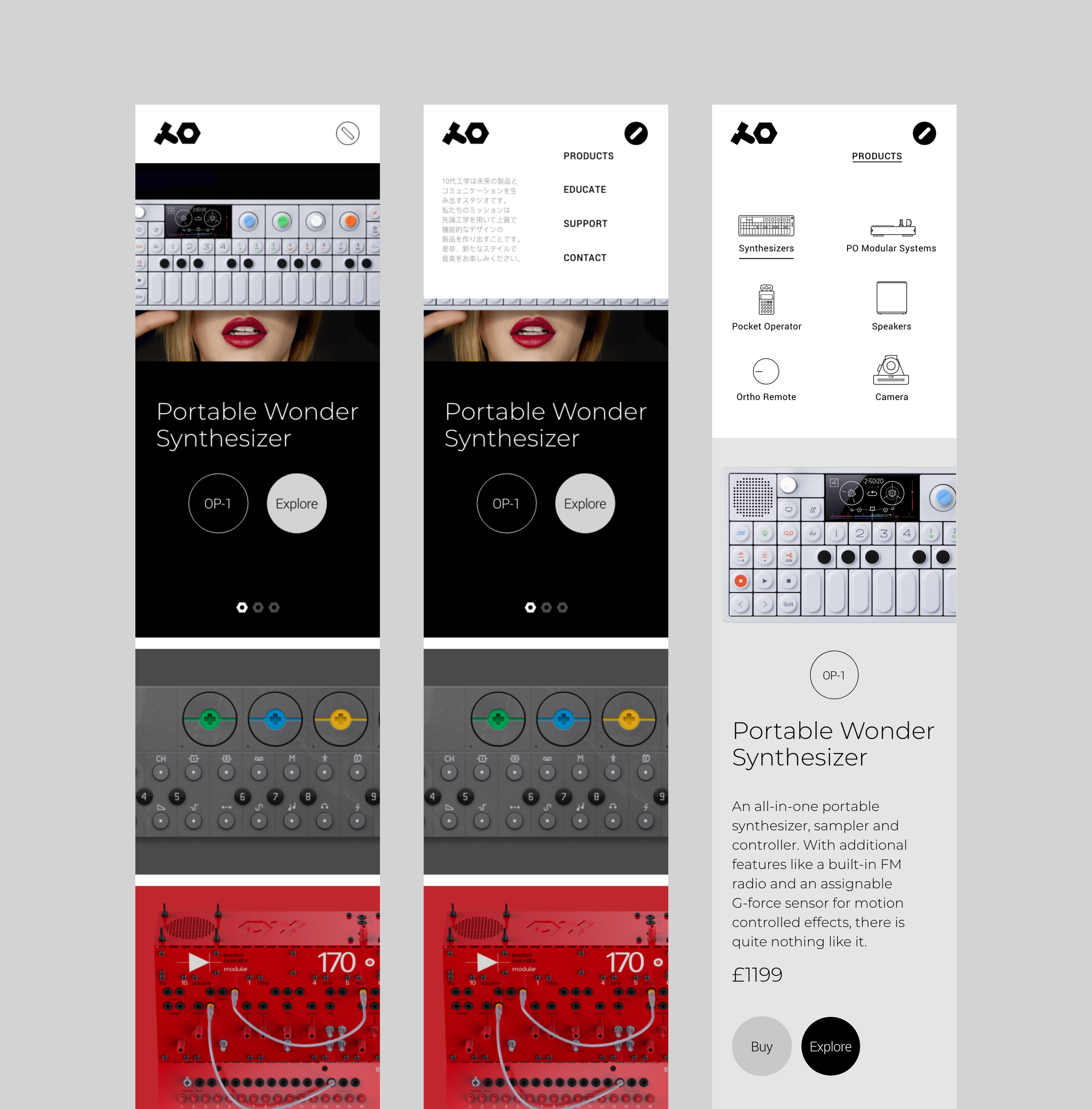
Their current navigation is unconventionally shown as big icons with simple listings. Although unique, it’s challenging to navigate other pages. To add, there is also a lack of consistency in function and visual appearance across different viewpoints. The mobile version feels like a design compromise because of the nav format and could benefit from further improvement.

To improve the user experience, I simplified the website’s navigation by introducing a sticky nav bar section and adding a fullwidth dropdown menu with the addition of new product iconography to help categorise products.
These changes will help to ensure that the navigation menu worked consistently across view-points such as mobile devices.

The landing page structure is revised to feature a portfolio-style grid, showcasing their current product shots and also adding hover overlays with item codes.

I updated their existing UI design system to work with my new navigation, site structure and utilise their lovely brand primary for functionality over beauty.


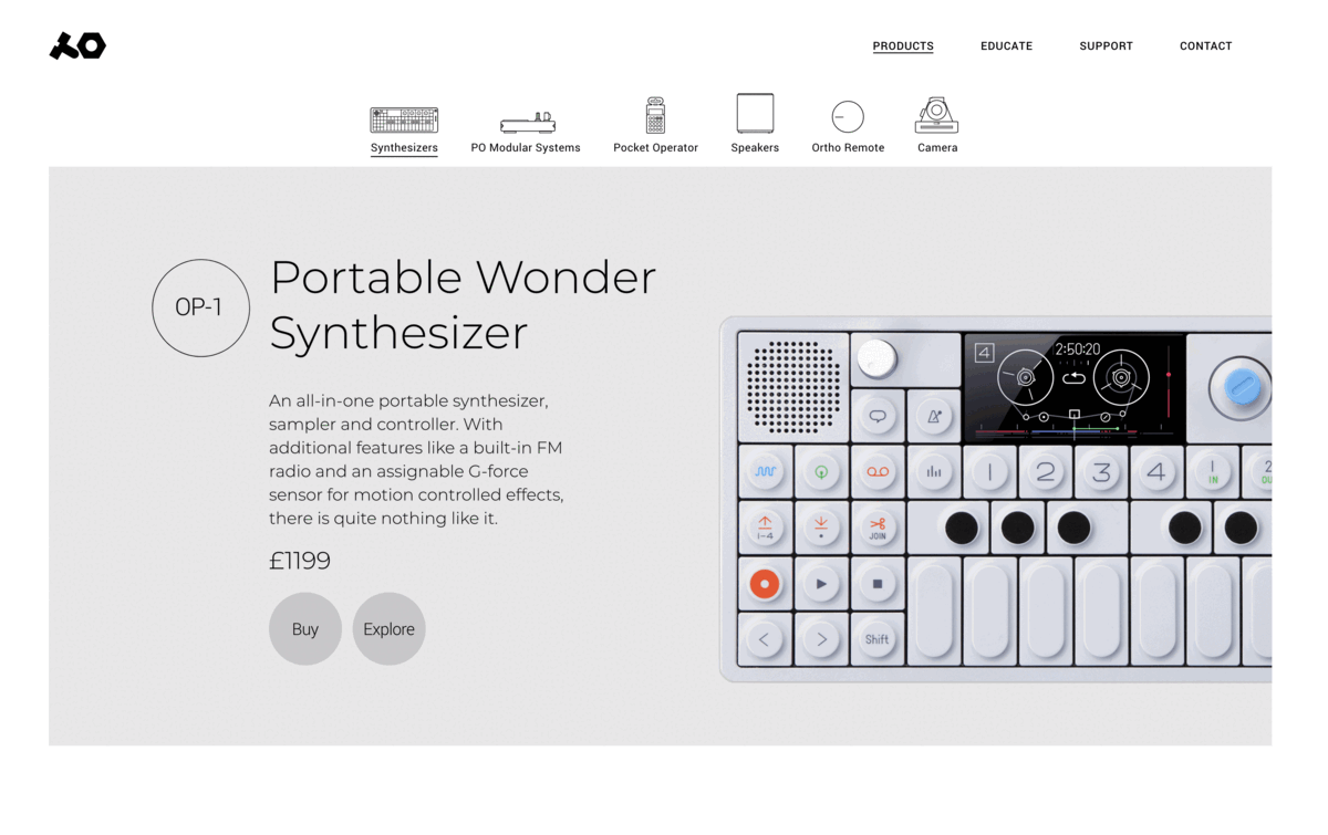
The current website is split into two sections, sending users to different areas of the site to actually view the same product which is unnecessary navigation.
For example, you have a separate page to explore the product in detail, then navigate again to a store page to view pricing and make a purchase.
To simplify things from a users perspective, it was logical to combine both features on one page. Each product could be displayed systematically with its price and a CTA button to explore in more detail as shown below.


With the added ‘explore’ button inline with buy on the same page (shown below), a user can now gain indepth details of products by just simply clicking once.
An accordion effect motion will happen on the same page to display more details underneath. Then a close button towards the end of the section would switch off the extra information, to enable further viewing of products in the same category.

The mobile responsive view (shown below), demonstrates closed and open menu listing. The open products menu will have iconography all within a mobile nav viewpoint, to mirror desktop views for design consistency and ease of use.